

I drove more account registrations by designing an auxiliary ‘Sign Up with Google’ flow.
Company: Morning Consult
Industry: Business Intelligence
Duration: September - October 2023
Role: Lead Product Designer
Responsibilities: analytics analysis and lightweight market research; user problem definition, solution discovery and product strategy; changes to user flow; high-fidelity UI documentation;

Morning Consult Pro is a subscription-based data and analysis product primarily targeted to business professionals.
Unlike its sister products in the Morning Consult product suite — which require going through a sales rep and entering into an enterprise contract — visitors can gain access to MC Pro by creating an account and selecting a subscription plan on the site. If and when a new visitor has exceeded the number of “free articles”, their access is blocked by a paywall. The paywall presents two calls to action: 1) subscribe for full access; or 2) create an account to continue reading the article you’re on.
The Business Problem
The MC Pro product was seeing a high number of first-time visitors. In fact, after launch, this number steadily increased month over month but we noticed that account creation wasn’t ticking up at the rate we’d expect. Site analytics indicated that the majority of users were abandoning the account registration process and even those that did follow through, it took an average of 10 minutes to complete. Aside from the obvious user acquisition problem, this also meant missing an opportunity to further nurture potential leads by not successfully capturing email addresses.
10 MINUTES
The average time it took users to complete registering a new account.
The Solution
Adding an inline option to quickly create an account via Google Authentication that shortens the number of required steps and keeps readers in the flow of reading an article. This resulted in an increase of 30% new account registrations. I also streamlined our default ‘sign up with email’ option so that both options have more parity with one another and to keep current registration consistent.
30% INCREASE
The new flow resulted in a net new increase of 30% in account registrations. Over 50% of all new accounts were created using the Sign Up with Google flow.
My Role: Product Designer
I worked closely with my Product Manager to collect the analytics data and build a report to summarizing our findings. We estimated the efficacy of implementing Sign In with Google and presented that solution as an experiment we wanted to run in our weekly planning meeting. I was directly responsible for creating new user flow diagrams, designing an updated UI, and presenting a Figma prototype to stakeholders for review. I was also responsible for handing off documentation to the engineer who would be implementing the feature.
Insights and Things I Learned
Intrusive messaging can help users avoid error states.
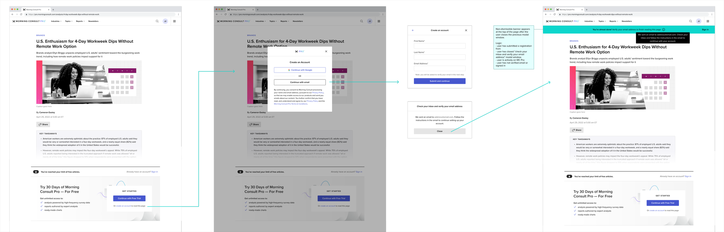
I’m very cautious when it comes to banner notifications and other always-present UI patterns. I believe those patterns should be used intentionally and sparingly; too often are they used as bandaids for greater UX problems. In the context of this problem, we still needed to support users who want to sign up by providing an email address (i.e., not through Google). I initially advocated to grant these users access to an article straightaway, without requiring them to verify their email address. However, my engineering teammate identified an permissioning issue that would put users in a limbo state if and when they return to the site. The solution was to keep users on the article as intended but display a persistent banner message at the top, informing them how to complete the account creation process.
Constraints can be re-thought with the right stakeholders, and the right context.
During a design review with stakeholders, our Legal team asked that users still be required to manually agree to terms and conditions by displaying the terms language and checking a box before continuing. This threw a wrench in our proposed solution as it added the same number of steps Google SSO would remove, effectively undoing the advantage of implementing SSO. After this revelation, I set up meetings with the Legal team to understand and work through what, if any, flexibility we had when it came to users agreeing to terms. We discovered that the real risk had to do with users agreeing to terms related to subscribing and paying for services, which wasn’t pertinent to users just creating an account. I also showed them examples of competitors who don’t ask users to check a box, but instead state clearly by continuing to create an account you agree to terms. All of this resulted in Legal better understanding our intentions and the user flows moved forward as planned. As an added bonus, it helped the Legal team identify redundancies in legalese could be eliminated and clarified for users.
Process
Visualizing User Pain Points
Mapping users’ journeys
Part of our technical architecture stipulated that account creation be handled by an integrated third-party service. The service required new users to verify their email address before they could even set a password. In real time, this meant a user would have to leave our app, log into their email, open the email and click the link, be redirected to a new window to set a password, optionally set up two-factor authentication, before finally being returned to our app.
That’s a lot of steps. The majority of users who started creating accounts were doing so in exchange for reading one free article. In the product-led growth philosophy, we talk about eliminating barriers and providing value early. I had a hunch that the number of steps were presenting too many hurdles and causing an imbalance in the value exchange.

To articulate this opinion, I visualized all the steps required and mapped out all the points of friction. I presented this to my Product Manager and Product Director who agreed this was worth prioritizing.

Diagram mapping possible user journeys
Identifying suitable product experiments
Market research & solution discovery
Signing up for a product or service with Single Sign On (SSO) providers like Google, Apple, Facebook is a relatively common pattern today. I worked with my PM to research and estimate the level of effort it would take to implement the popular providers. Part of this process included reaching out to Customer Success reps to get a breakdown of email domains from current customers. We decided to focus on implementing Google SSO first, based on our own customers and the large number of potential users that use Google for their personal emails and company emails.

Image of paywall before solution
Defining scope & strategy
There are several places in the app where sign up and sign in can occur. The goal of this experiment wasn’t to touch all of them — it was to learn if our Google SSO solution made a difference. We decided to focus on implementing a solution into the paywall component first. The thinking was that pages which displayed our paywall had the highest volume of impressions and thus would be better to assess performance. If analytics showed thats it takes users less than 10 minutes or users choose it more often, we’ll consider deploying it to our checkout process and canonical sign in page.
Finding the ideal user experience
Reducing friction
Since I had spent a lot of time thinking about our sign up and account creation flow, I was pretty familiar with the number of steps and what was required. Still, I always find it best to start low-fidelity and make sure my goals and assumptions are identified before jumping into higher fidelity documentation. I had two experience goals in mind:
to reduce the overall friction in account creation, with friction being defined as: the average time to completion and the number of user-facing steps.
to keep users in the context of reading an article whenever possible.

Updated user flow with Google Sign-in implementation
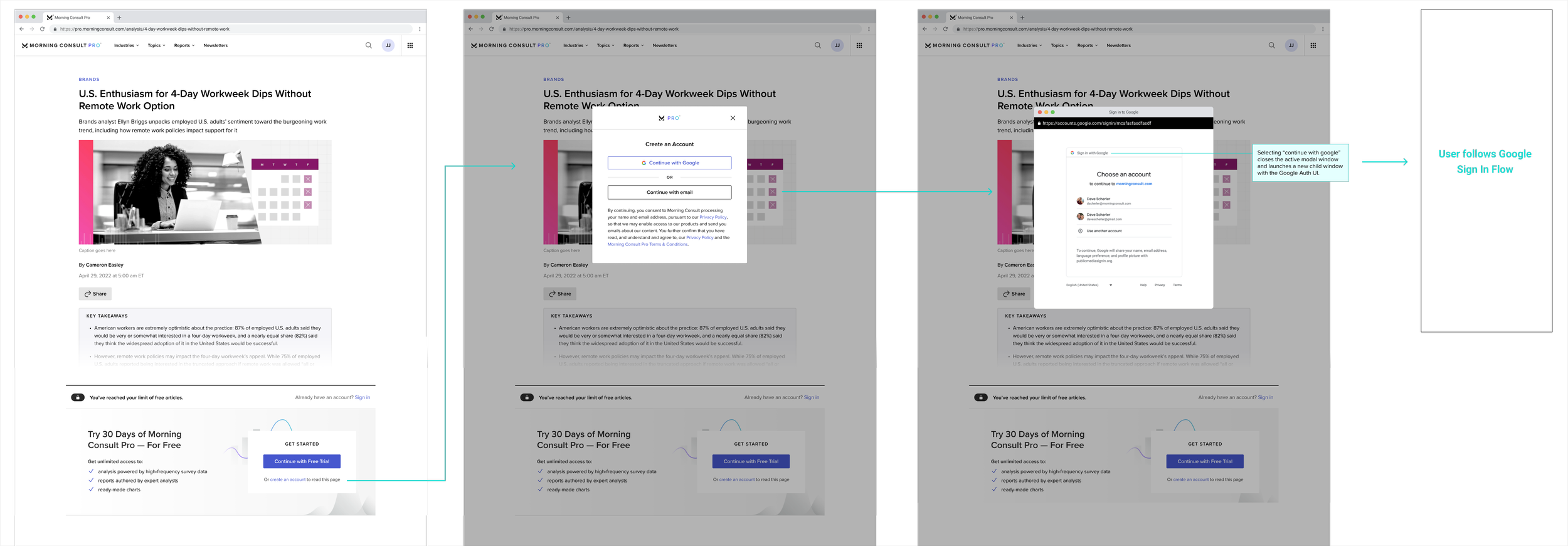
It was the second goal that lead to a design decision to display the sign up options in a modal window and the Google SSO steps in a new child window, styled as a small modal window. This allowed us to redirect users to the Google authentication page without losing context of the article behind it. Pairing with an engineer on some clever styling we were able to deliver a seamless sign up experience in what felt like a single modal window. The combination of modal and child window created a sense of focus on the sub-task of sign up, giving them clear start and end steps and re-positioning sign up as a low-effort, means-to-an-end to getting the thing you want: written expert analysis.
UI DESIGN
Spec work
Here’s an example of the spec work I did for this UI.
I paid close attention to visual hierarchy, spacing, and accessibility—making sure buttons were clear and actionable, typography was readable, and form elements were structured for an intuitive experience. The consistent use of spacing (S, M, L), color, and typography guidelines helped create a scalable and cohesive design system. I also incorporated user feedback states, such as email verification prompts, to guide users smoothly through the onboarding process.
I always contextualize my visual design mockups with detailed annotations. Still, I find no annotation beats a good old fashion meeting so I collaborated closely with developers to make sure they understood my design intent. The final result is a structured, intuitive sign-up experience that enhances usability while maintaining brand consistency.

A win for product experiments
Our product experiment proved successful as the time to register dropped dramatically and new account registrations increased 30% over the ensuing month. Beyond the user experience improvements, this project also laid the groundwork for how to properly identify measurable product bets, ship a solution quickly, and measure its impact.
Finishing Up
One of my favorite examples of the power of design.
Implementing Sign Up with Google isn’t the sexiest solution to write home about. Many products and services utilize this pattern. In fact, at the time, we could have shipped another net-new feature with a fancier UI. Instead we shipped more value to users by implementing a low-effort solution that was used straight away. This hardened my belief that getting the problem right is better than getting the solution right. This project was a win-win-win: an inexpensive design and development effort, a highly usable and used new feature, and an immediate impact on our key performance indicators. It’s not sexy but its still a product designer’s dream.